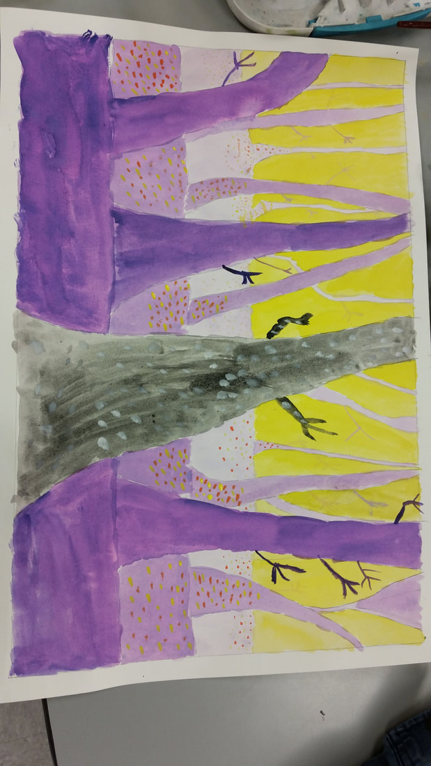
 This art project that we recently did is called the spooky trees project. The goal of this project was to draw and paint a few layers of trees and paint them with contrasting colors to give them an eerie vibe. One new skill that I learned and worked on to improve was how to use contrasting colors to really make the colors stand out. The contrasting colors that I decided to use were yellow and purple. Color was one of the art elements that I really emphasized because I colored the trees purple which contrasted with the yellow background. Also the shape of the trees was another key art element to make the trees look good, and I decided to give the trees more of a cartoon look. Color helped create contrast with the yellow background contrasting with the varying shades of purple trees. The shape of the trees helped create proportion, as I tried my best to make the trees in the background smaller than the trees in the foreground. The spooky trees that I painted really give off an eerie vibe because of the interesting choice of colors and the shape of the trees.
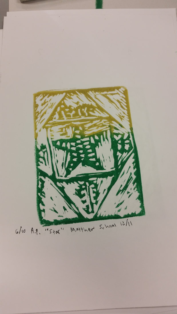 The name of this project was the printing project and the goal of it was to trace a design on an eraser-like thing, lay paint on the design, then print the design on a piece of white paper to make a colorful print. One new skill that I learned during this project was how to create a texture on a print, which I did on the star in the middle. Shape was created in this print with the shape of the star and the diamond/box shape lines surrounding the print. Color was also very important when you were making the actual print, as I decided to go with a gold/green color combination. With the color where the two colors meet creates a contrast which really intrigues the viewer. The shape of the star helps create an emphasis that the star is the main part of the print. Overall, this print creates a positive mood as it reminds me of the holidays and spending time with family.
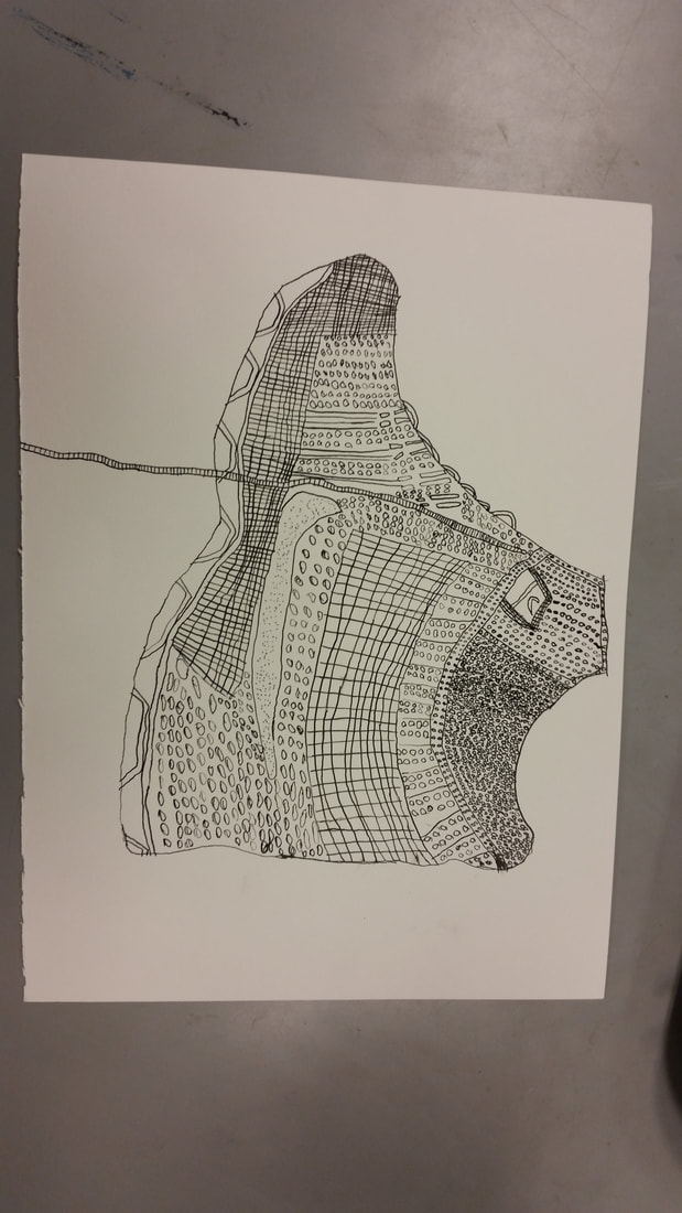 The name of this project was the ink pen drawing. In this project, we had 3 options: we could either draw our shoe, our hand, or a plant, all with an ink pen. I decided to go the shoe route. One new skill that I learned was how to cross hatch, hatch, and how to do stippling. I used all three of these skills in my shoe drawing. The cross hatching and other new skills that I learned helped create a visible texture on the shoe. It was very important for the lines to be as straight as possible, which I tried my best to do. The texture and lines helped create a pattern in parts of my shoe with the cross hatching, hatching, and stippling. The overall mood of this drawing is dark, as the entire drawing is in black and white and it gives off an eerie feeling.
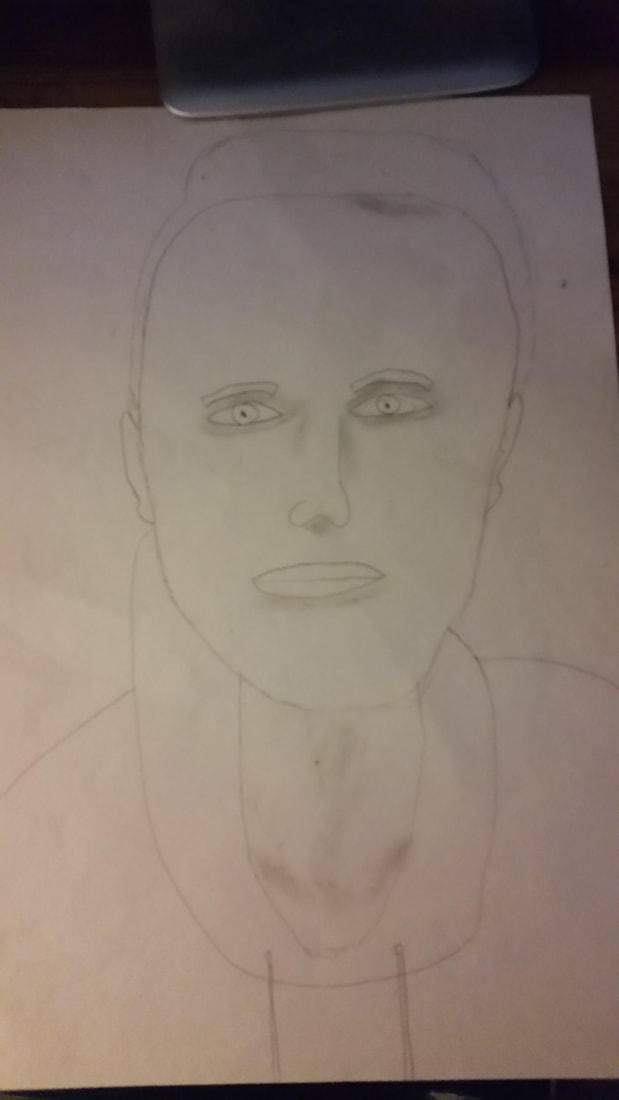
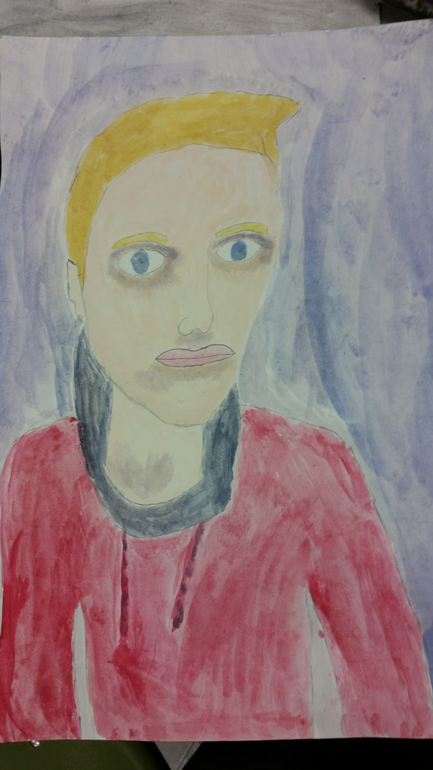 This project is called the 3/4 self portrait with tempera paint. The goal of this project was to take a picture of ourselves looking away from the camera at a 3/4 view, draw that picture in pencil, then paint over it using tempera paints in class. One new skill I learned was how to draw a face from a 3/4 view, as it was slightly different than drawing a face from a head on view. Since the face is turned slightly, the eyes and mouth and nose are all slightly shifted, which took a few tries for me to draw correctly. Color was an art element I used in this project, as I had to get the correct skin color and lip color, which was the most difficult part about that. I also again, had to get the shape of the head down, which I feel that I did an a lot better job this time than with my last self portrait. The colors create a contrast, as the background color that I chose really compliments my red sweatshirt and the color of my face/hair. The shape helps create a balance and proportion, because the shape of the head is one of the most important parts so you can lay down the other features of the head correctly. The way the background colors compliment the person in the picture creates a soothing or relaxing feeling.
 The name of this project was our self portrait and the goal of this project was to take a picture of ourselves where we are facing the camera, then use a pencil and paper to recreate that picture. One new skill that I learned was how to make the face proportionate to an actual human face by doing things such as making sure the eyes are in the middle of the head and the edge of the lips line up with the eyes. Making sure the shape of the head was the correct shape was one of the hardest things to do for me, as I had to erase many lines and redo them, but in the end, I think I did pretty well on the shape of the head. I also created space with the distance between the eyes and nose and mouth and the empty space on the forehead. The shape of the head helped create proportion, as you need the shape of the head down before you can make the other parts of the face proportionate to each other. The art and design elements I used help create a relaxing mood, as you are looking at a self portrait of someone who looks relaxed with a neutral face.
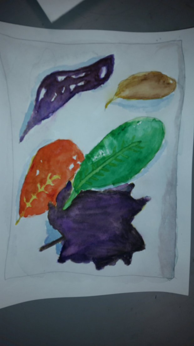 The name of this project was the leaf painting and the goal of it was to go outside and find some leaves, them put them of a white sheet of paper and do our best to recreate them using watercolors. This was the first time I have used watercolors in a few years and I feel like I was able to learn how to mix the colors to create other colors that don't come in the paint set. I also did better at starting with the light colors such as yellow, which is something I have struggled with in the past. I utilized shape, which is an art element, when I was drawing the outlines for the leaves. I also used color when I had to mix different watercolors to get the proper leaf shade. These art elements help create contrast in the leaves and variety in the colors. The mood in this painting is peaceful because the way the colors of the leaves compliment each other and how some of the leaves overlap.
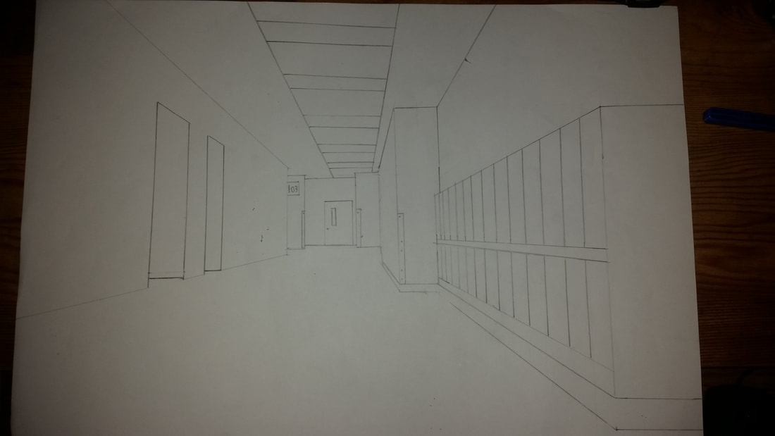 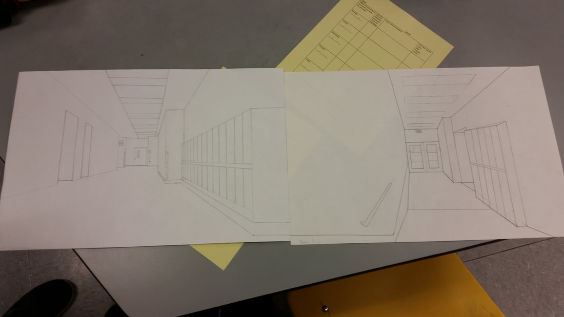 The name of this art project was the school hallway drawing. The goal of this project was to get with a partner or two and each draw a hallway in the school that connects together then line them up for a picture. I did not learn many new skills in this drawing, as it was very similar to the room drawing we did the week before. However I was able to utilize a vanishing point and making sure the diagonal lines all met at that point a lot better since I had more practice with that skill. I emphasized the lines and made sure they were all straight. I made sure to make the diagonals connect to the vanishing point, the horizontal lines to be parallel, and the vertical lines to all be parallel. I also emphasized shape to make sure everything in my hallway was the proper shape and were proportionate to how it looked in real life. I also feel like the individual lockers create a rhythm and they start out appearing smaller and they get bigger as they get closer, which is also another example of how it demonstrates proportion. This drawing gives me a relaxed feeling as it is a plain hallway and it is so peaceful compared to when it is filled with kids.
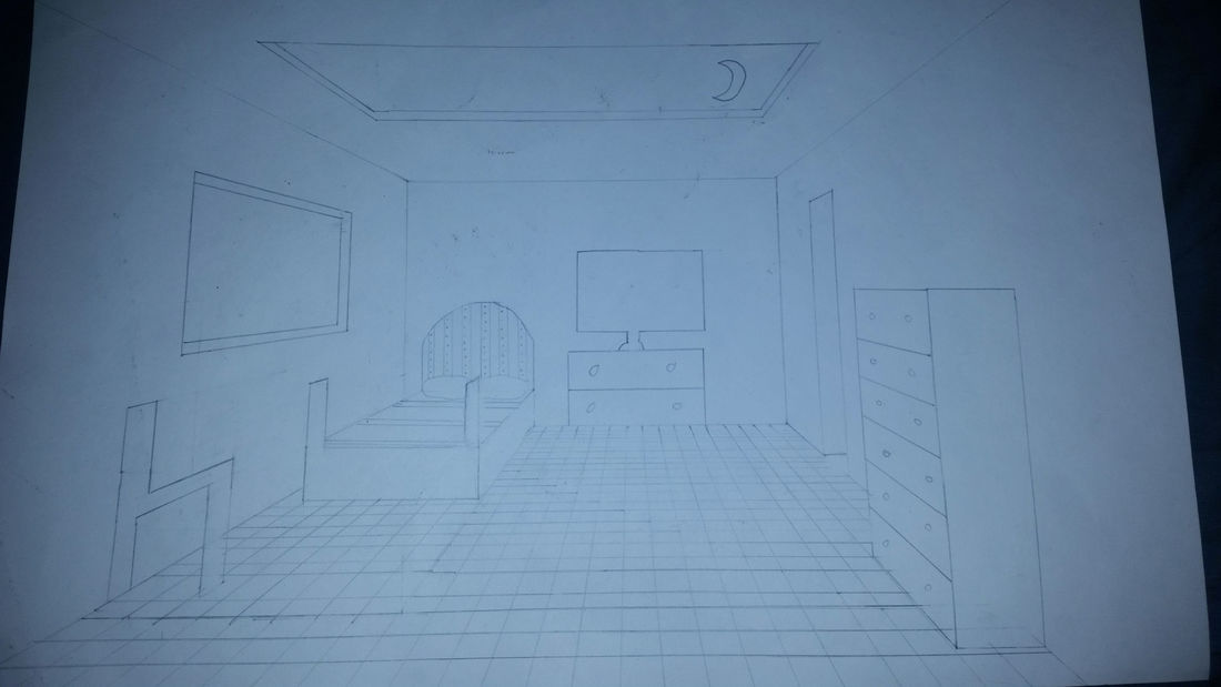 The name of this drawing was our dream room drawing. The goal of this was to use a one point perspective to create a our dream room on a piece of paper. Before I started working on this drawing, I did not know much about vanishing points or how to to use them in my drawing. Once Mrs. Heideman explained how to use them, I felt like I was able to effectively use them in my room to give it a perspective like you are actually in the room. Lines had to be straight and either horizontal to each other, vertical, or connecting to the vanishing point to give it that perspective. Space also had to be filled to make the room look complete. The lines helped create proportions in the room so one object would not be much bigger than the other if that was not actually the case. The way the lines connect to the vanishing point and how the room is laid out creates a relaxed feeling when you look at the drawing.
|
AuthorWrite something about yourself. No need to be fancy, just an overview. Archives
January 2018
Categories |
 RSS Feed
