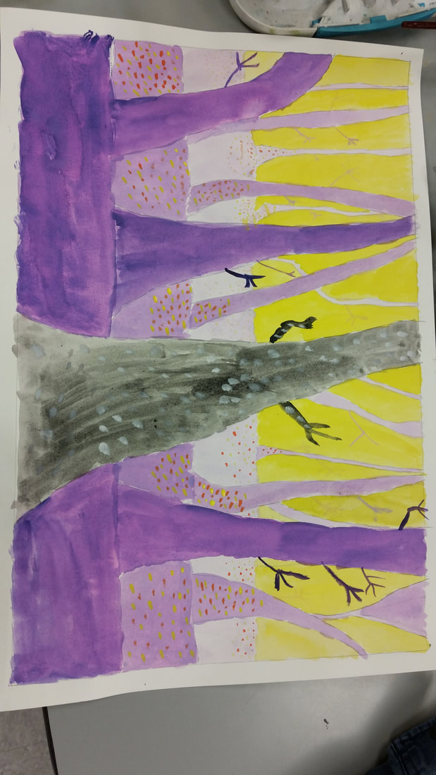
 This art project that we recently did is called the spooky trees project. The goal of this project was to draw and paint a few layers of trees and paint them with contrasting colors to give them an eerie vibe. One new skill that I learned and worked on to improve was how to use contrasting colors to really make the colors stand out. The contrasting colors that I decided to use were yellow and purple. Color was one of the art elements that I really emphasized because I colored the trees purple which contrasted with the yellow background. Also the shape of the trees was another key art element to make the trees look good, and I decided to give the trees more of a cartoon look. Color helped create contrast with the yellow background contrasting with the varying shades of purple trees. The shape of the trees helped create proportion, as I tried my best to make the trees in the background smaller than the trees in the foreground. The spooky trees that I painted really give off an eerie vibe because of the interesting choice of colors and the shape of the trees.
0 Comments
Leave a Reply. |
AuthorWrite something about yourself. No need to be fancy, just an overview. Archives
January 2018
Categories |
 RSS Feed
